Helping marketers evaluate ad creative quality
Lead Product Designer, Vidmob, 2024
Challenge
My Role & Impact
Redesigning Vidmob’s core scorecard reporting experience to modernize an outdated UI and improve score visibility and reliability for advertisers.
Context
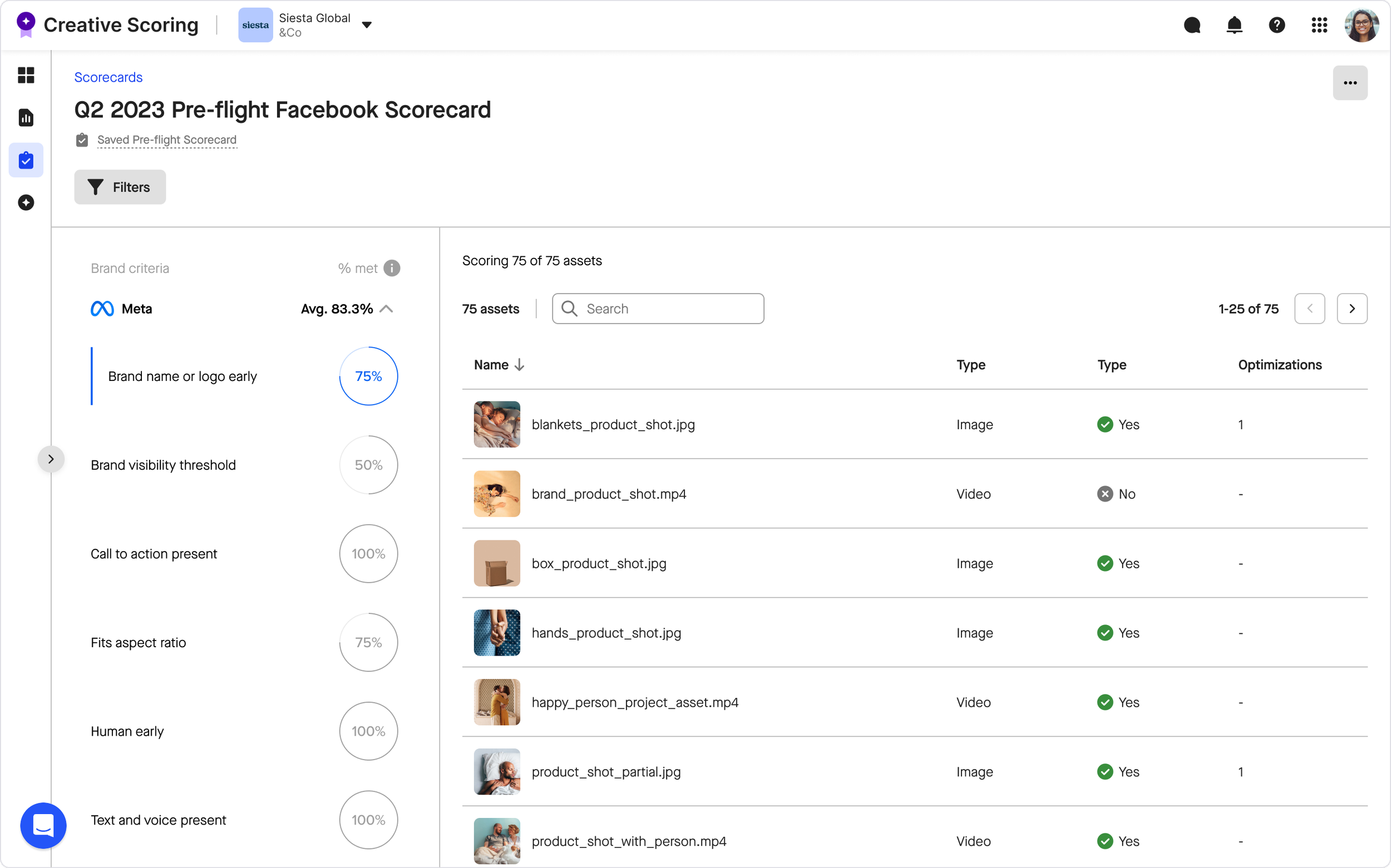
Scorecards are one of Vidmob’s most heavily used reports, helping advertisers assess whether creative assets are ready for launch by surfacing quality scores based on brand requirements and platform best practices.
Problem
Over time, the scorecard experience had become outdated and error-prone, leading to reduced trust in the data and limited visibility into how scores were calculated. Advertisers struggled to quickly understand readiness at a glance.
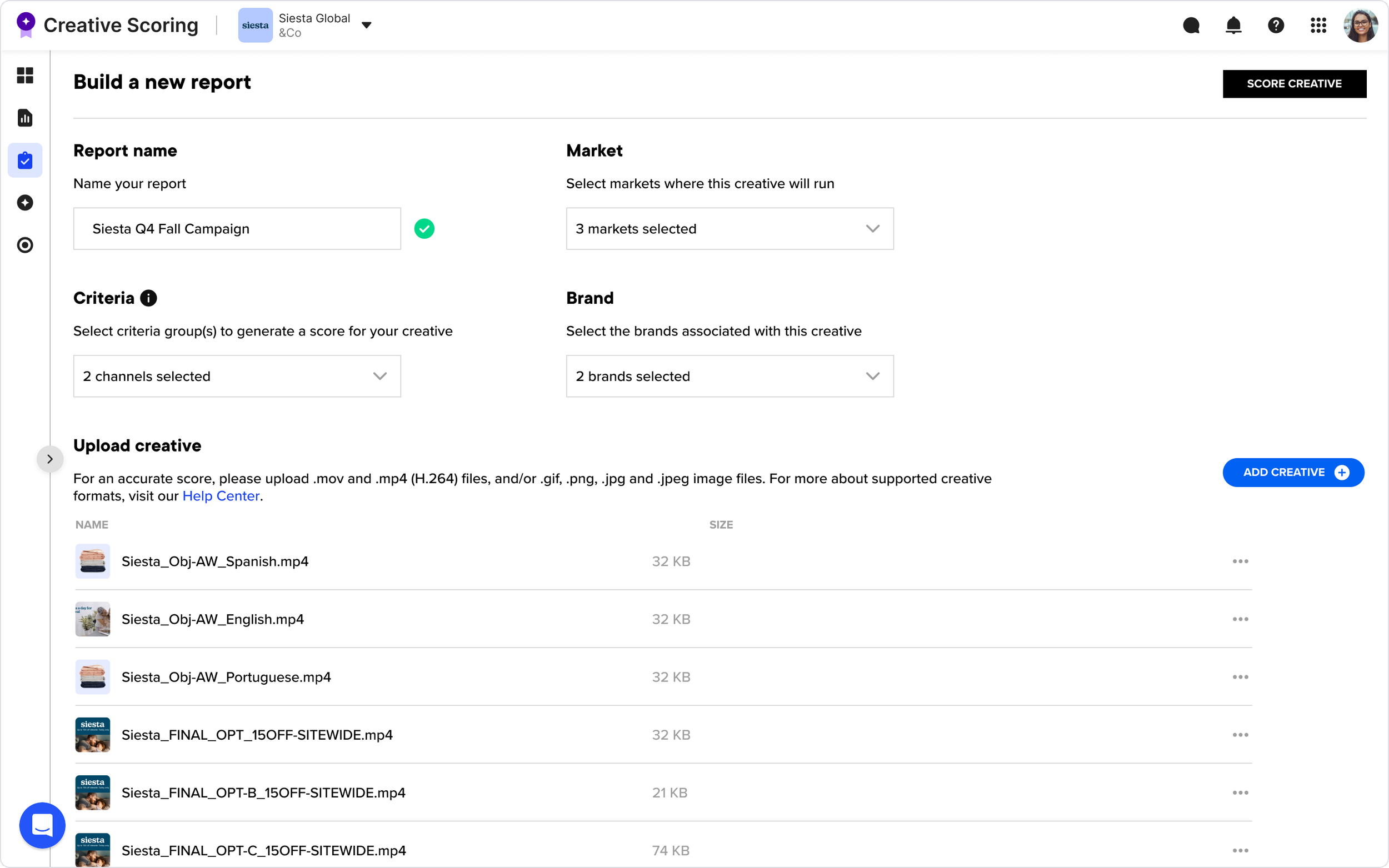
In addition, Vidmob supported two distinct scorecard report types that shared the same UI but served different use cases and relied on different data sources. While the underlying system could support both, the redesign required carefully balancing shared patterns with meaningful differences, such as manual uploads for preflight scorecards and more advanced filtering expectations for in-flight scorecards.
💡 Definitions
Criteria: A criterion in VidMob Creative Scoring is a defined creative rule or best-practice checkpoint that an ad asset is evaluated against.
Score: For each creative, VidMob’s scoring engine tests whether that creative meets the criterion, tagging it as passed, failed, or sometimes not applicable
Existing create scorecard view
Existing scorecard view
As design lead, I led the end-to-end design of this project, including:
Proactively initiated the scorecard redesign after identifying recurring usability issues and gaps in score visibility through customer feedback and firsthand product use.
Built early design concepts to frame the opportunity, partnered with product leadership to align on scope and priorities, and led the end-to-end design through rollout.
Collaborated closely with product management, and engineering to align user needs, technical constraints, and reporting logic.
Defined a shared UI framework that supported two distinct scorecard types while allowing for meaningful differences in workflows and data.
“Good case study of how a tool can be powerful yet simple.”
— Vidmob CTO
“This is amazing. Total game changer.”
— Strategist, on reviewing the redesign
Goals & Success Metrics
This redesign was grounded in direct feedback from advertisers actively using scorecards. While updating the experience to align with our new design system was important, the primary focus was responding to real user pain points and workflows. The following goals reflect the key outcomes the redesign needed to achieve.
-
“It’s hard for me to know which assets are in the report and how they are adhering at a glance without having to click into each one.”
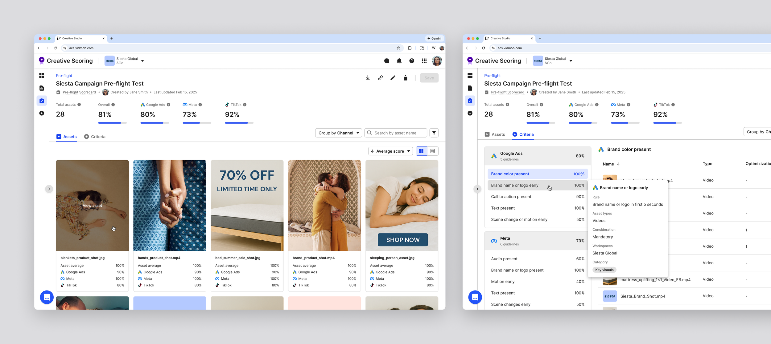
Users needed to quickly see which assets were included and how they were performing without drilling into each row. This goal informed the layout hierarchy, prioritizing asset-first visibility so that the most critical information was immediately accessible. -
“I use these reports to know which platform I should run the creative, but I can’t see how each creative is adhering across channels.”
Advertisers needed top-level metrics and channel signals visible immediately to guide campaign decisions. This led to placing key performance indicators at the top of the report, enabling faster cross-channel comparisons and actionable insights. -
“I want to customize the way I group my criteria, rather than just by channel.”
Users wanted control over how they viewed and grouped criteria. To meet this need while keeping reports consistent, we introduced toggleable group-by views, allowing users to analyze data in ways that matched their workflow without breaking the shared UI framework.ription text goes here -
“I don't know what pass vs fail means without knowing what each of these criteria really means.”
Users needed to understand how scores were calculated to trust the report. Clear criteria definitions and tooltips were added, making pass/fail states and individual criteria transparent and actionable.
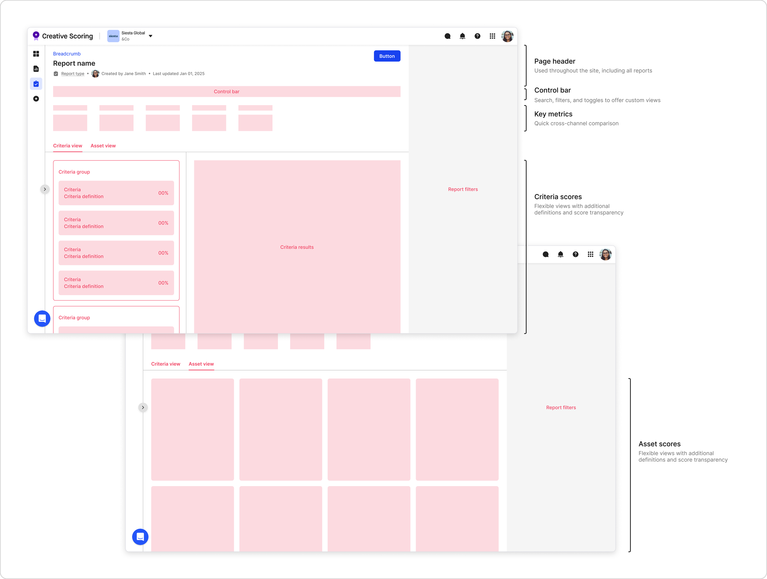
This feedback and goal-setting informed the first round of wireframes. I translated these goals into layout and hierarchy decisions, using existing page structure components, shared design system elements, and custom elements where necessary to support clarity, flexibility, and scalability.
Key Decision:
Information Architecture
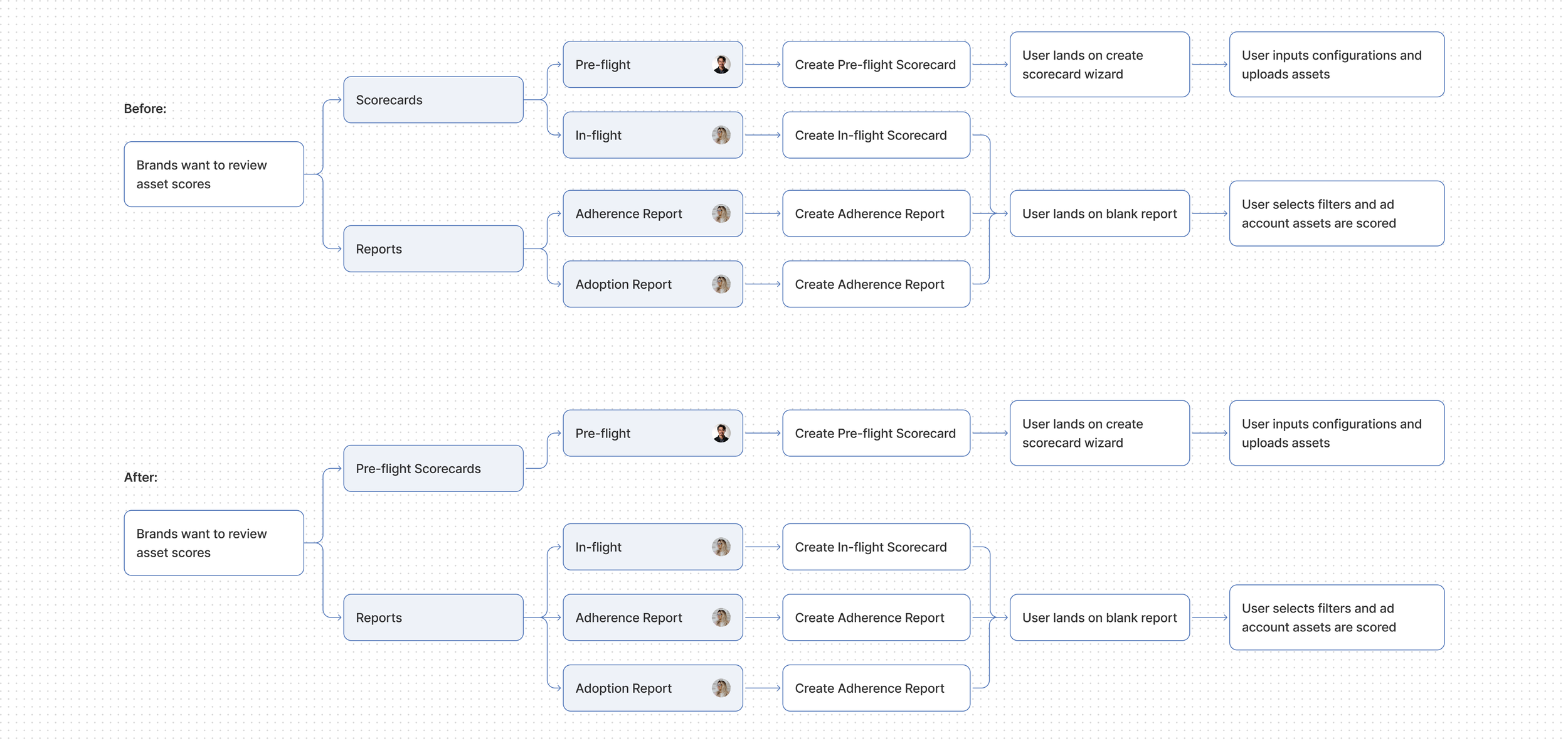
Updating our navigation to support separate use cases
Pre-flight and in-flight scorecards shared the same UI, but research showed they served different users and workflows. Users scored preflight assets first, then validated live assets in in-flight reports. We decided to move them in navigation to match these workflows while keeping shared UI patterns for consistency and reduced cognitive load.
Key Decision:
Report Setup & Criteria Selection
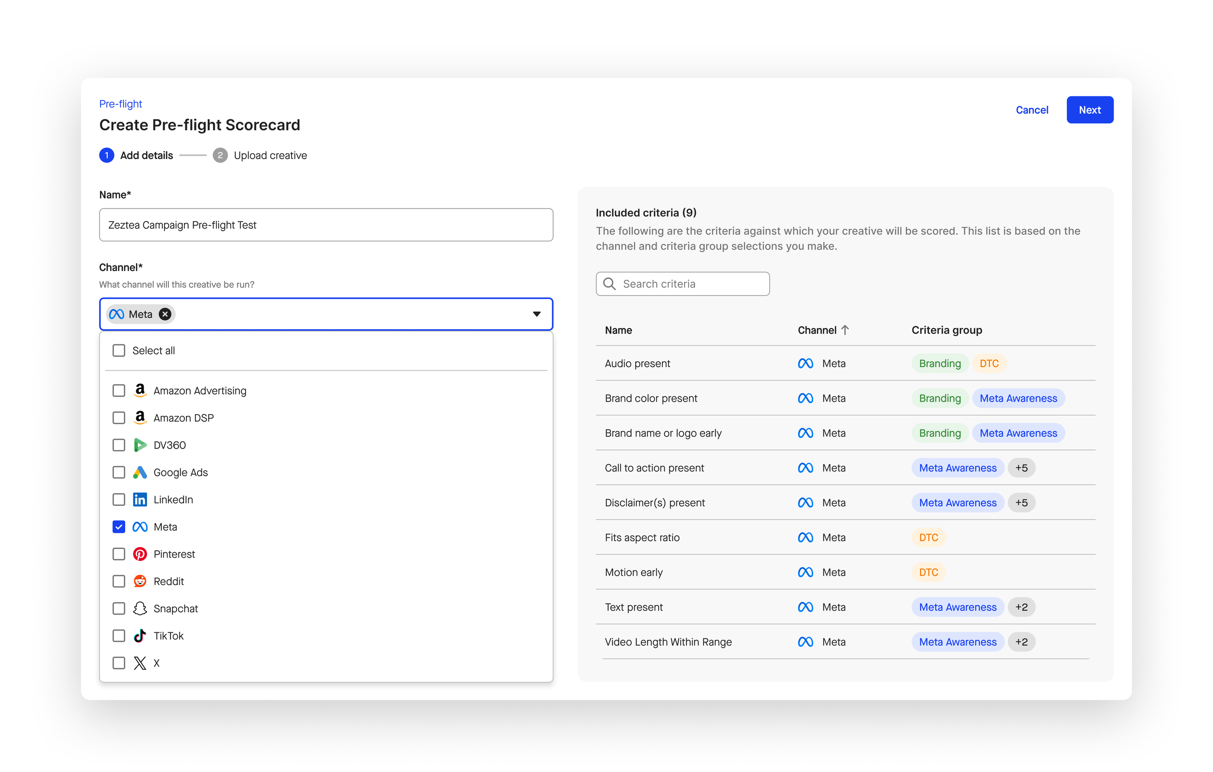
What criteria are scorecard assets scored against?
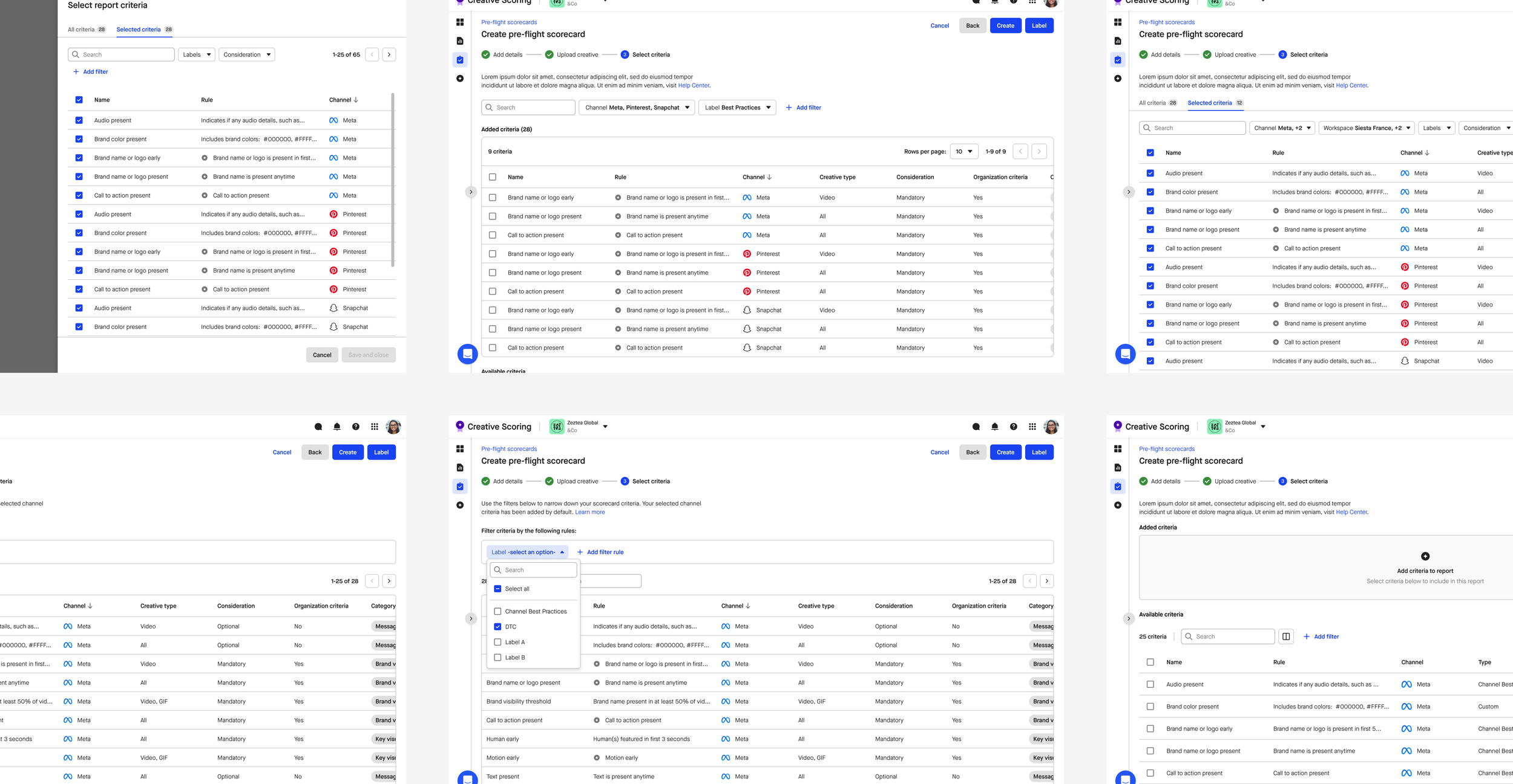
A core discovery question was how scoring criteria should be applied, especially for in-flight reports that do not have a traditional setup flow.
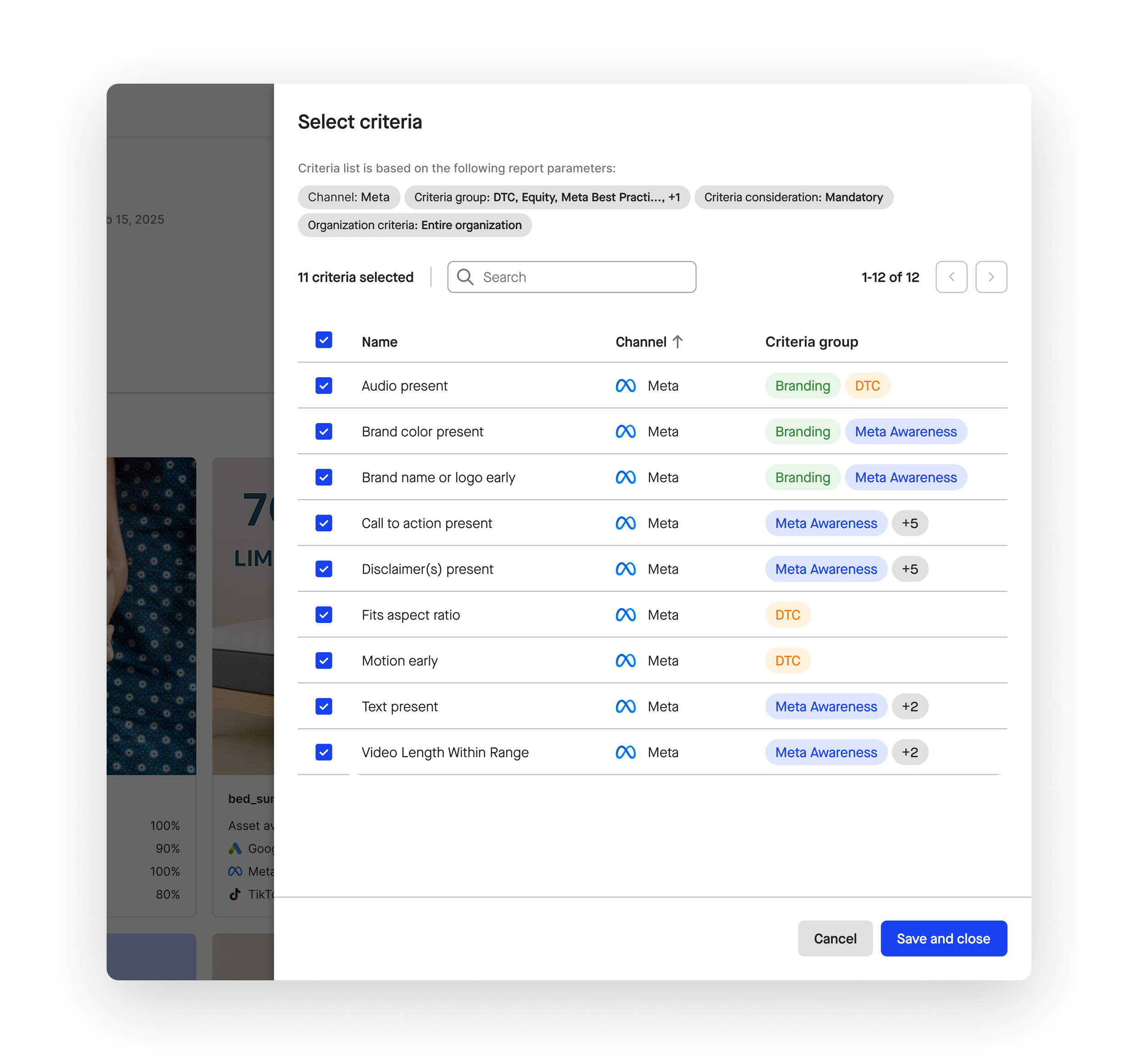
Early assumptions favored manual criteria selection. Research, however, showed that criteria are mandated at the organization level to ensure consistent evaluation standards. I explored early concepts that allowed users to manually select criteria to test the earlier assumption, and we learned that users preferred having all criteria come into the report by default, but still offer some filtering abilities.
If users can’t choose which criteria are applied, how might they still understand and interact with them?
I explored patterns that preserved organizational consistency while giving users flexibility, such as:
Automatically including all mandated criteria
Allowing users to toggle criteria visibility on and off within the report
Providing clear definitions and contextual detail for each criterion
A critical consideration here was that pre-flight scorecards were manually created, while in-flight scorecards were automatically generated. So might I accommodate both use cases while maintaining design consistency?
Criteria visibility during manual Pre-flight set-up
By reframing the problem from user-controlled selection to organizational consistency with user transparency, I was able to understand what the users actually wanted: visibility into what criteria would be included in the report based on their report settings.
Criteria control across Pre-flight and In-flight Scorecards
While criteria inclusion needed to remain consistent, users still needed flexibility when reviewing scores. To support this, I designed a shared criteria filter panel that allows users to toggle criteria visibility on and off within the report. This gave users temporary, exploratory control to test and compare criteria without permanently altering the underlying scoring model.