A cross team design sprint to redesign the business subscription sign-up flow that utilized research to create a sign-up experience that is seamless and streamlined.
Challenge: The existing design of the Office 365 sign-up experience for business customers is owned by different teams across Microsoft, so the end-to-end design is incoherent. In six weeks, redesign the sign-up experience of Microsoft 365 business products in order to create a seamless and streamlined experience.
Role: Product designer (May 2019-June 2019)
Problem
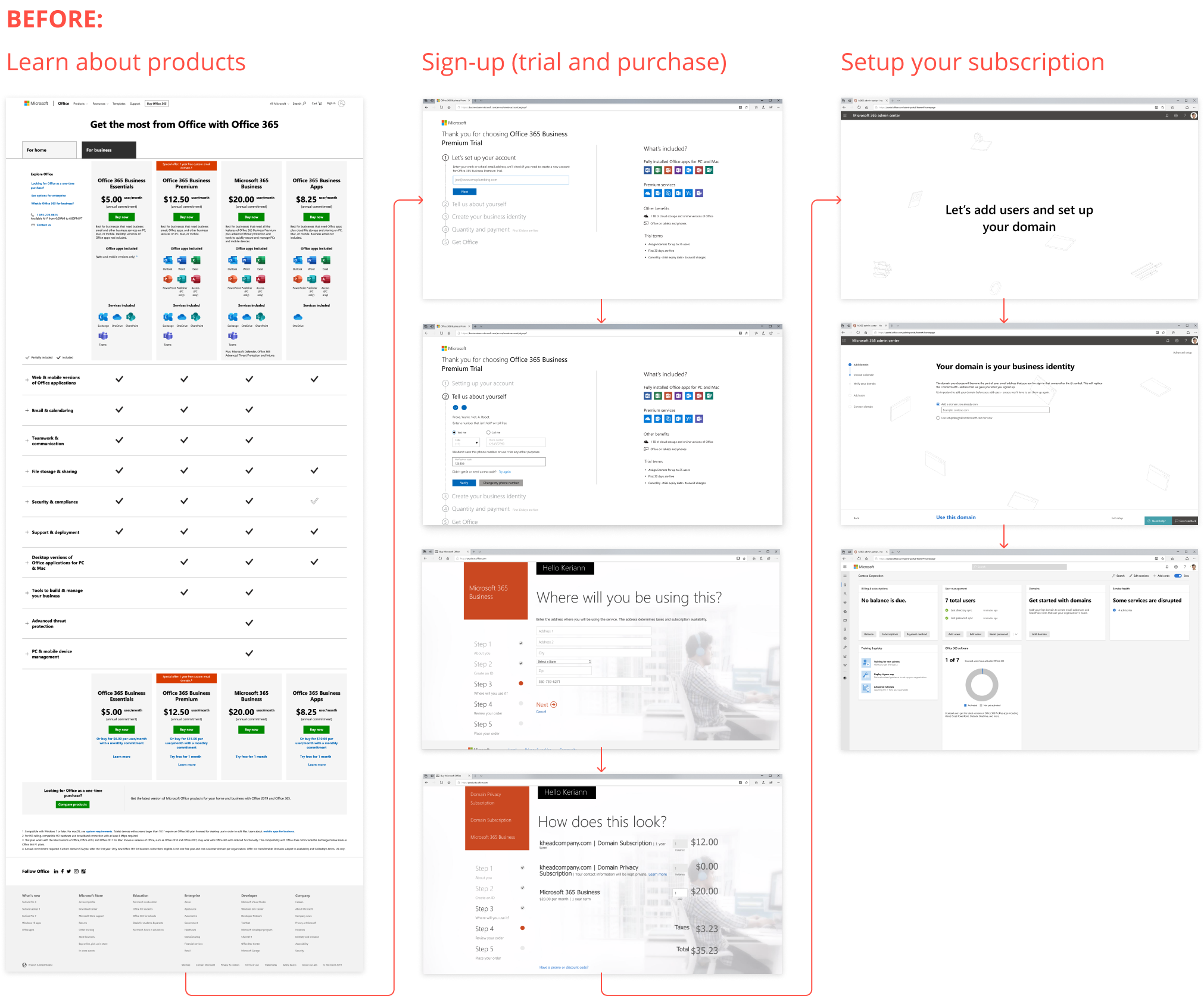
Small to medium business customers that purchase Office 365 products for their company do so online, similar to consumer customers. They learn about product offerings, sign up and purchase a product plan, then set up their organization with products and services.
However, the three product surfaces that are part of this experience are owned by different teams within Microsoft and the end to end experience is incoherent.
Solution
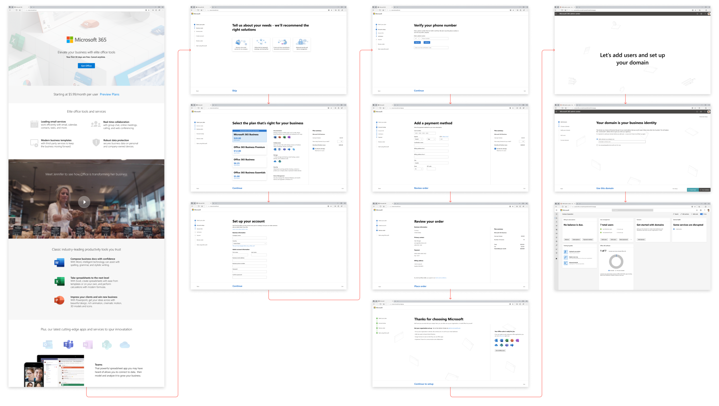
In order to work through the design problem, it was important that each of these teams were involved in the design solution. Select members from each product team joined together to form a virtual team. This virtual team worked together as a modified design sprint. A few hours each week (in addition to our normal workloads) we worked to produce a recommended design solution. We would deliver our designs to each product team that they could continue to refine and implement within 12 to 24 months.
Over six weeks, we redesigned the sign-up experience of Microsoft 365 business products in order to create a seamless and streamlined experience.
Research
In early 2019, a research study was conducted to explore how business customers navigate the Office 365 purchase experience and identify necessary optimizations. Some of the key learnings from this study were:
Trouble choosing a plan
Customers didn’t know which plan was right for their business, and wanted assistance choosing but not restricted to a recommended plan.
Adding a domain was disruptive
Customers felt the domain step interrupted the purchase flow, and there wasn’t enough guidance on how to complete this step.
Purchase interruptions contribute to drop off
Customers wanted similarly themed questions and felt a purchase interruption would contribute to their drop-off.
Incoherent end to end design experience
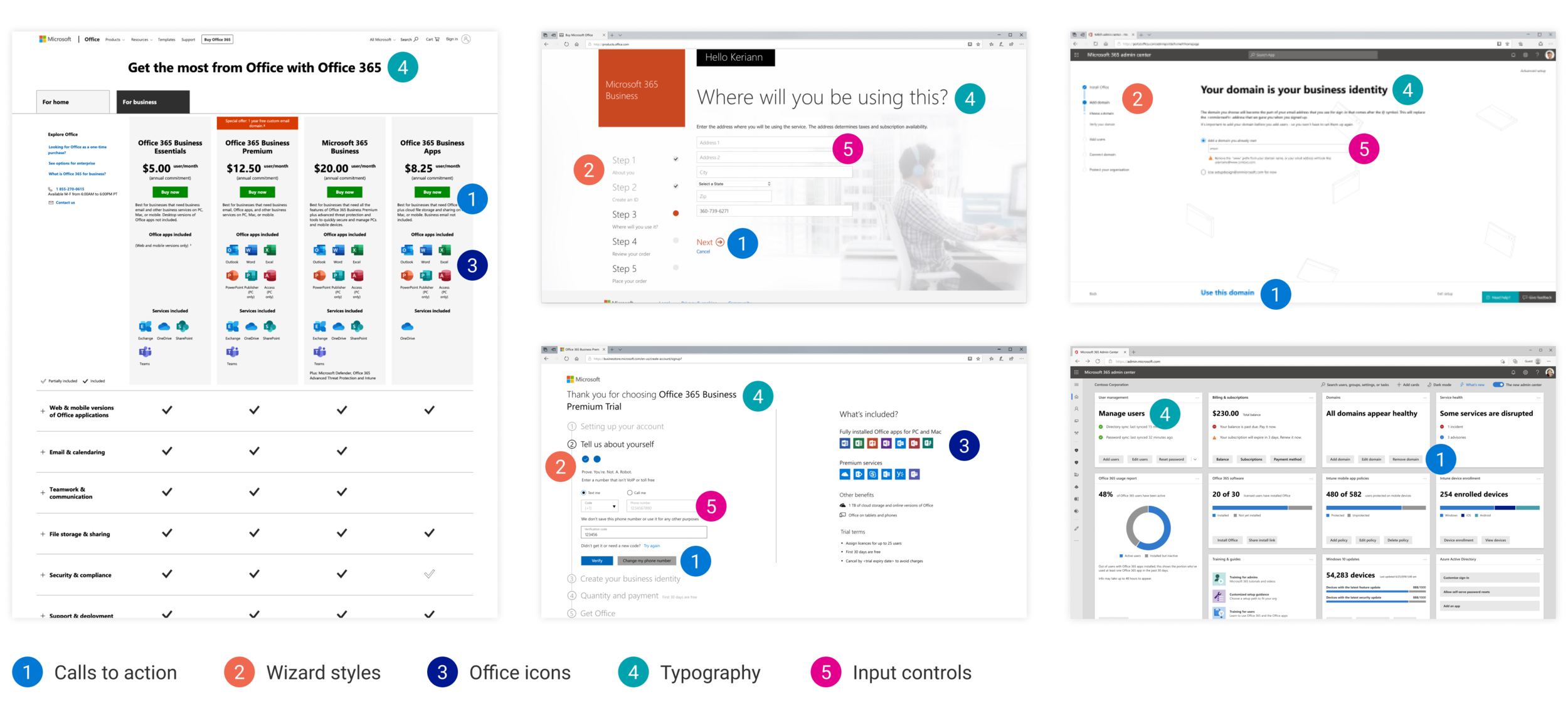
Customers felt the design patterns and overall experience was incoherent across the entire flow. Below is my analysis of the different design patterns that could be found in the existing experience.
These research findings helped inform our design decisions and gave us insight into what design updates we should prioritize. We decided to focus on helping customers know which product is right for them, remove the domain step from sign-up, and bring consistency to the experience with similar visual styles and interaction behaviors.
Design goals
My design sprint team consisted of marketing, commerce, and Admin Center designers. Early in the project, after consolidating research findings and analysis of the existing experience, my team and I established design goals we wanted to meet with the redesign.

Seamless user flow
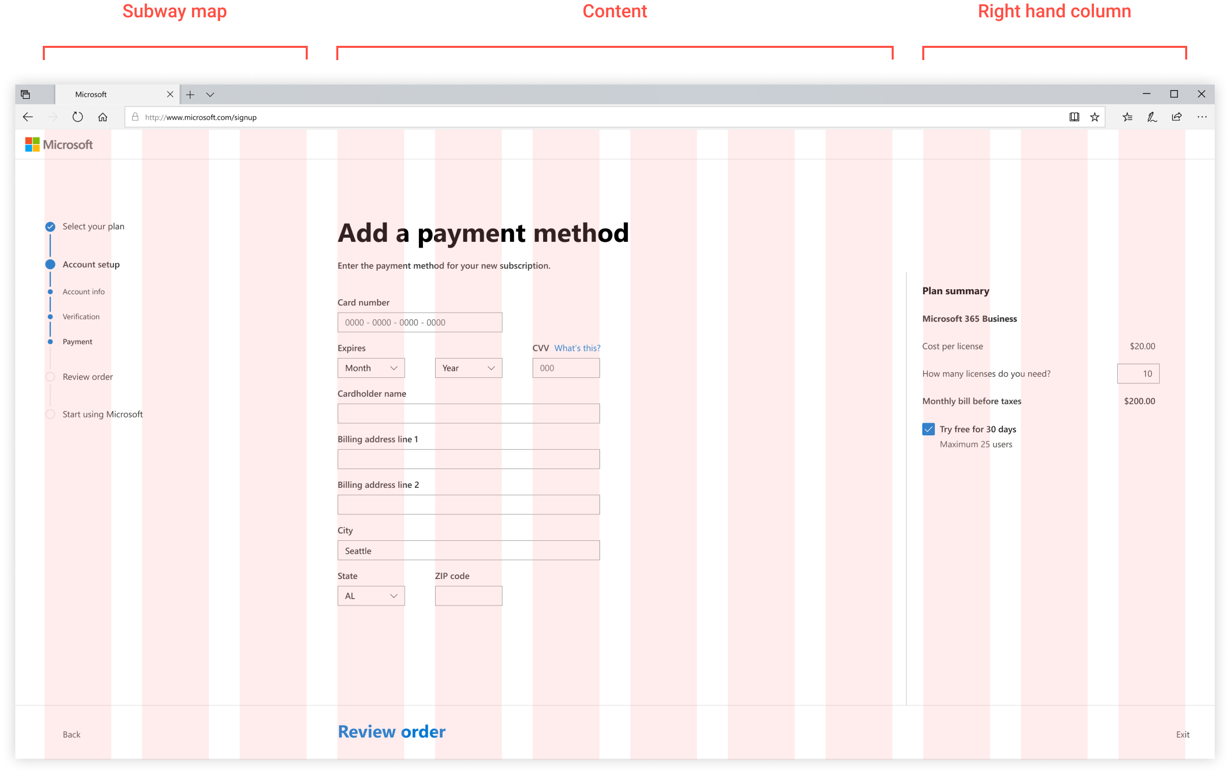
I began our design process by organizing the steps into a user flow to ensure information requests weren’t duplicated. I removed steps that interrupted the flow (domain setup) and made sure there was a natural progression from beginning to end.
We divided the design amongst the individual team members and I was responsible for redesigning the middle section of the flow, sign-up.

Visual coherence
A coherent design guide was important to this effort because we had to bridge three different experiences and they each had their own design patterns. We decided to integrated graphics and theme colors from marketing (awareness) and Admin Center (setup). In order for sign-up to feel coherent with setup, we utilized the Admin Center and Fluent design controls.
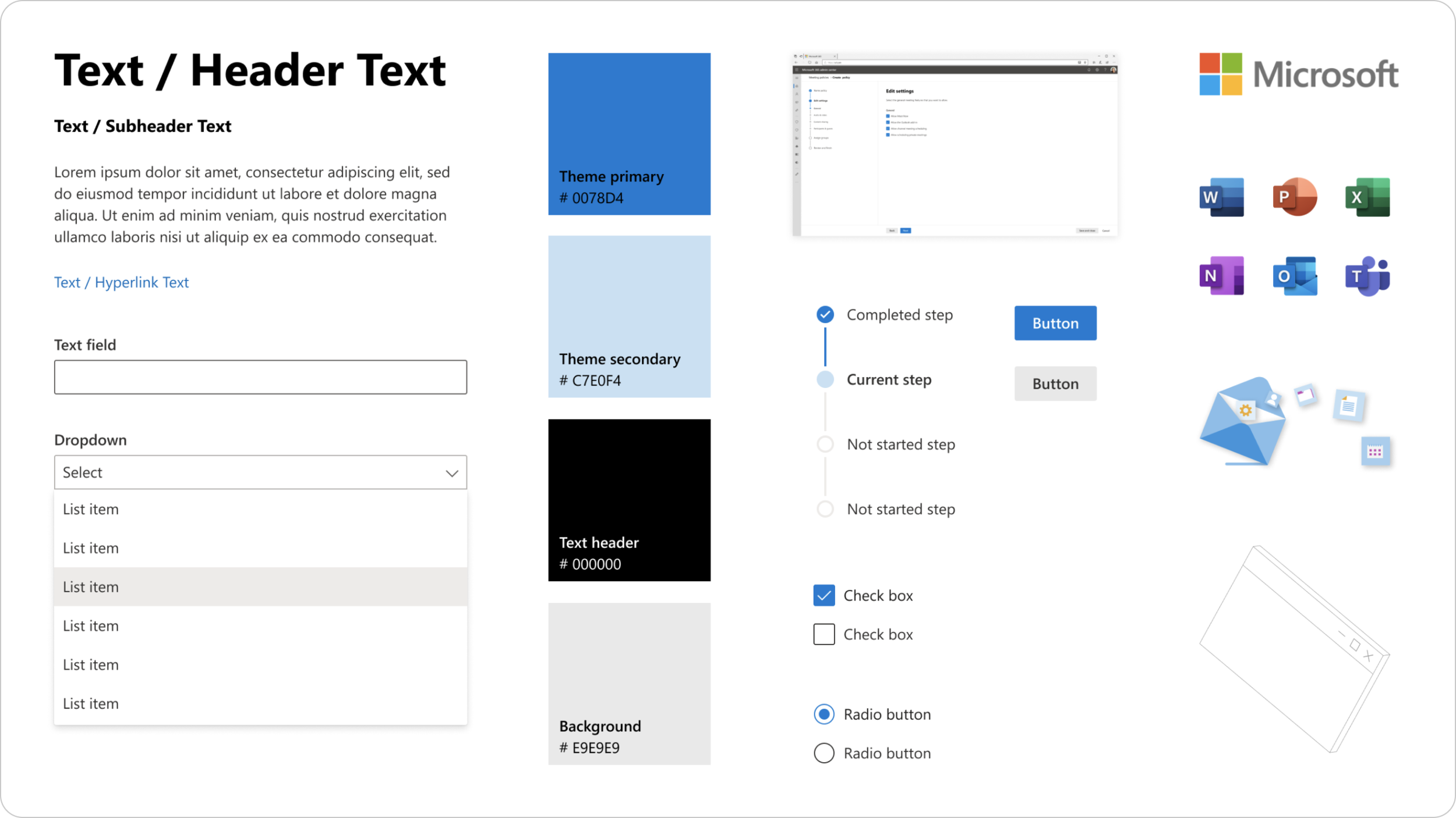
Focused and clear interface
The existing sign-up process used two different wizard patterns, and both were outdated.
In order for sign-up to feel coherent with setup, we adopted the Admin Design System wizard. This responsive wizard design is laid out using a 12 column grid, dividing the content into sections in order to provide clarity for the user to focus on the current step’s task.
Providing guidance
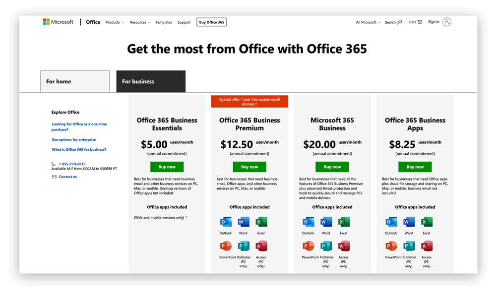
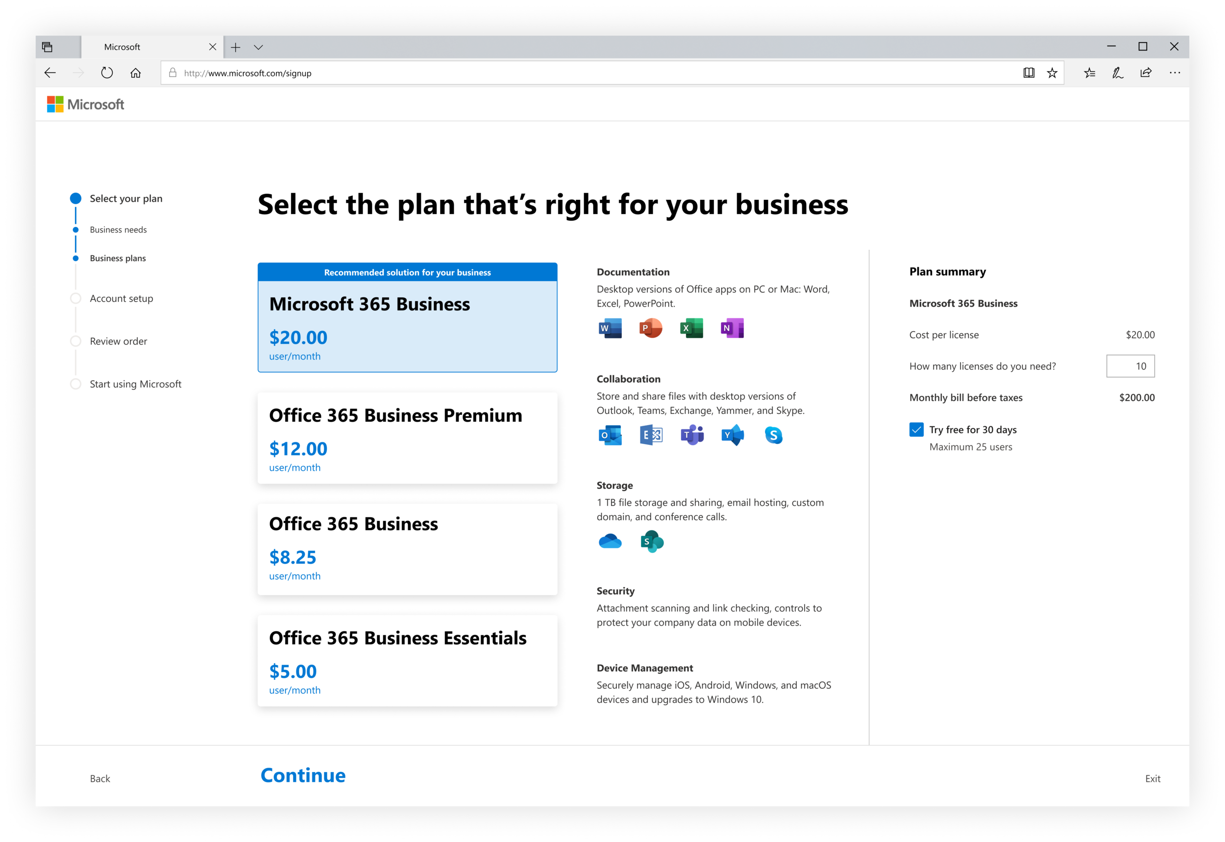
Microsoft offers a variety of business plans, and it is important the customer knows which product best fits the needs of their company. The current plan comparison chart is a common method for comparing plans and subscriptions, but we heard from customers it did not help inform their product selection. I wanted our design to go beyond the comparison matrix to give users a better understanding of product features.
How do we provide a guided product selection to ensure customers know which product is right for them?
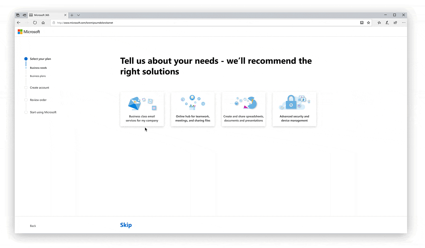
Designing a guided product selection
If we were to create a guided selection for the user, we’ll be able to provide the value of a personalized experience for each customers and a trusted recommendation from Microsoft.
I explored different ways we could guide customers through this selection process, and presented design explorations to our team as well as our Admin Center design critiques. The team unanimously decided to proceed with developing designs using the structure of option 2.
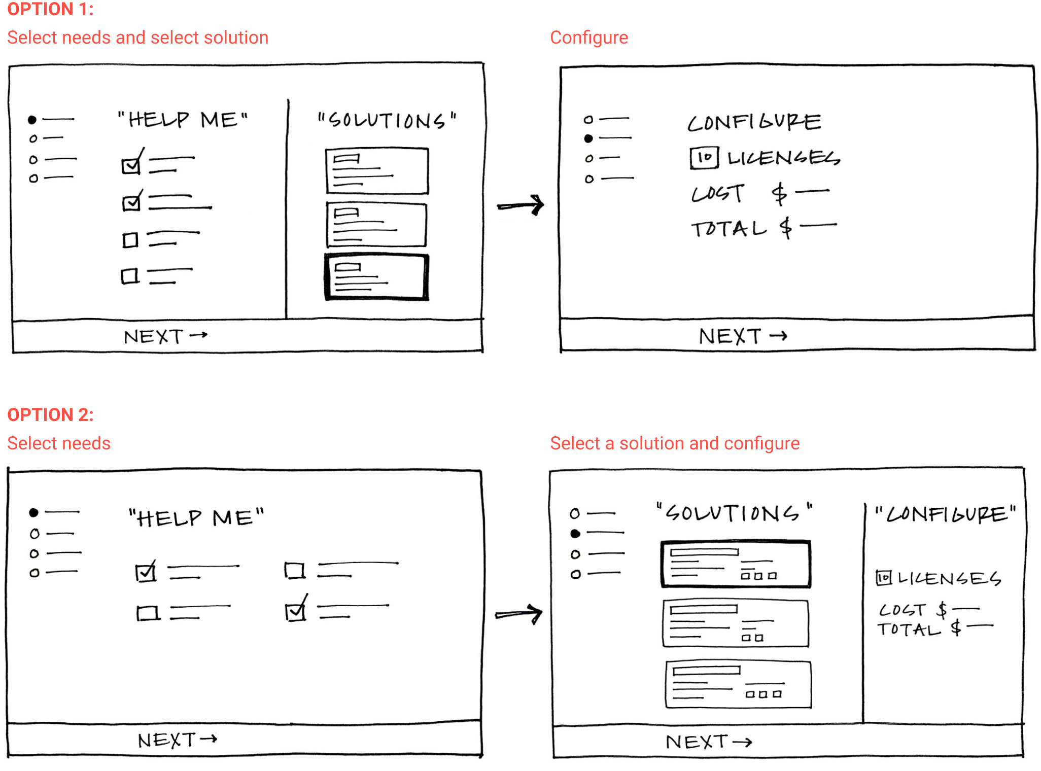
Iterating on the guided product selection
I continued to iterate on the two steps of the guided product selection: asking users about their company’s needs, and selecting a product.
Instead of the static comparison chart that uses excess space on empty cells and check marks, I decided to explore an interactive tool to inform the customer of plan features. My goal was to be efficient with the space available and reduce the amount of duplicated information. It was important the user has a clear understanding of each plan available and how they compare in order to make the best decision for their company.
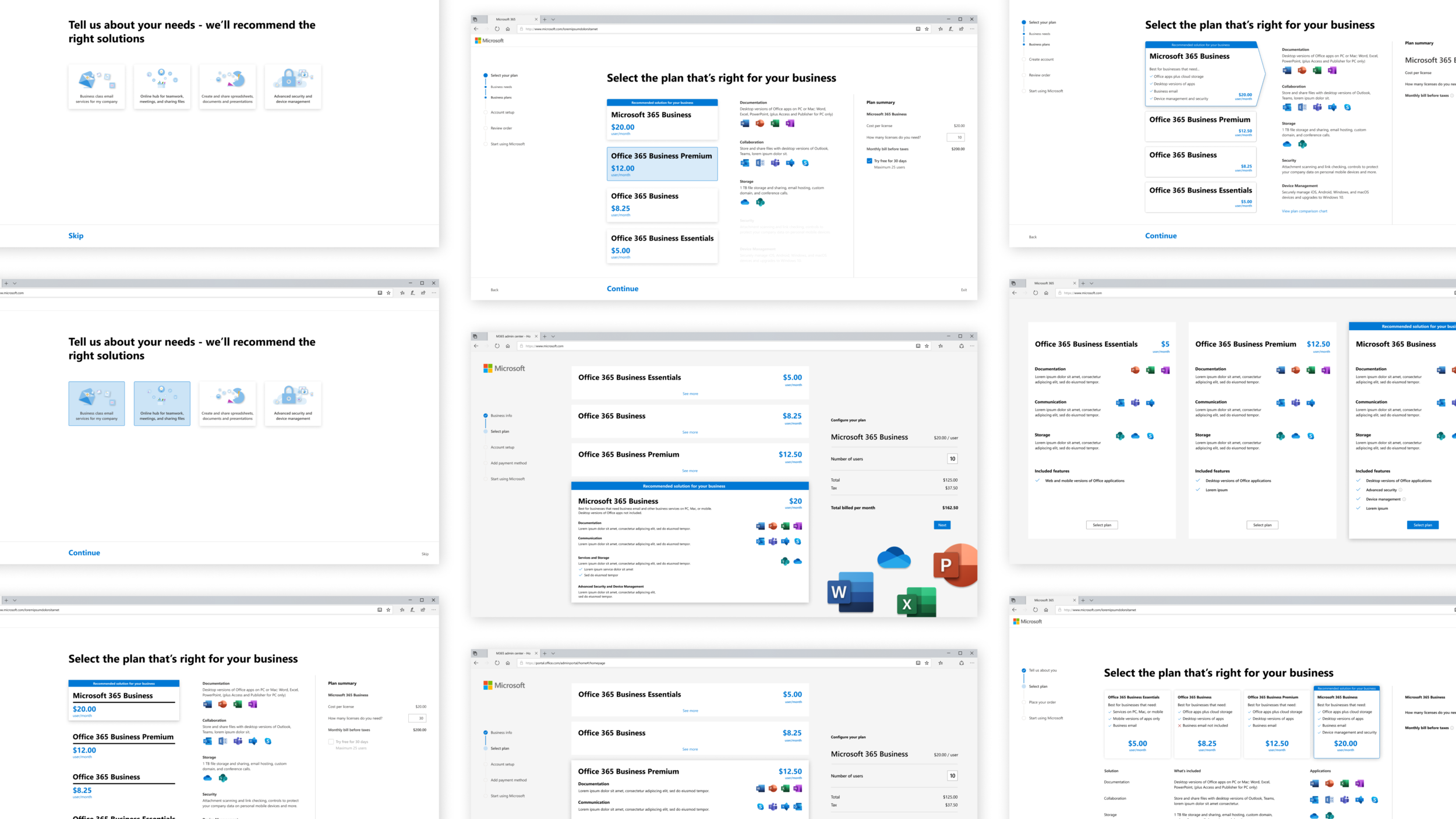
Final product selection design
Final outcome
The designs were presented to leadership and approved to be integrated into each team’s work. In preliminary testing, most participants:
Preferred the new design
Preferred product details on the right side of the page
Thought it was helpful to have product pricing and details reinforced throughout sign-up
Felt the visual transition from sign-up to setup was smooth
The next steps are for each team to validate the design hypothesis by testing each element and portion of the new design.